We usually focus more on “buying”, but seldom notice the interaction design that contains strong logic but is relatively subtle on the presentation layer. The core motivation of e-commerce platforms at the strategic level is to make the users to experience better, faster and happier, so the design of interaction is more inclined to guide shopping decisions.
JD.com (Jingdong)
1. Deepen personalised shopping recommendation and highlight them
When user is sliding down and not yet reaching the personalised recommendation section, a floating box displays and point to the recommendation section, which is highlighted with bright red, as shown below.
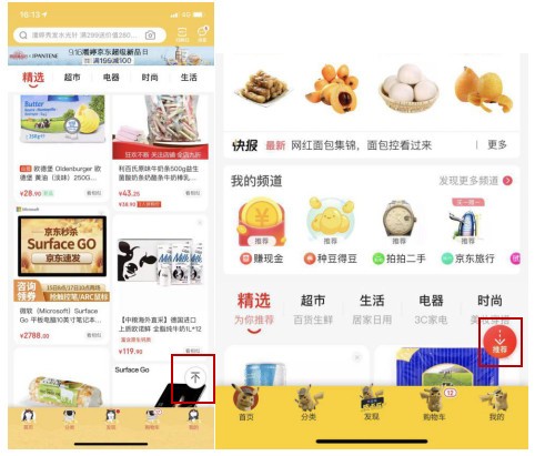
It can be seen from here that JD attaches great importance to personalised recommendation. The design of the recommendation box also precisely reflects the intention of the platform to make personalised recommendations. At the same time, users' data in the recommendation engine will be improved in turn, and the shopping characteristics of them will be enriched, so that the recommendations can reach users more accurately and make the purchase.
2. One-click to modify the application scenario of the promotion
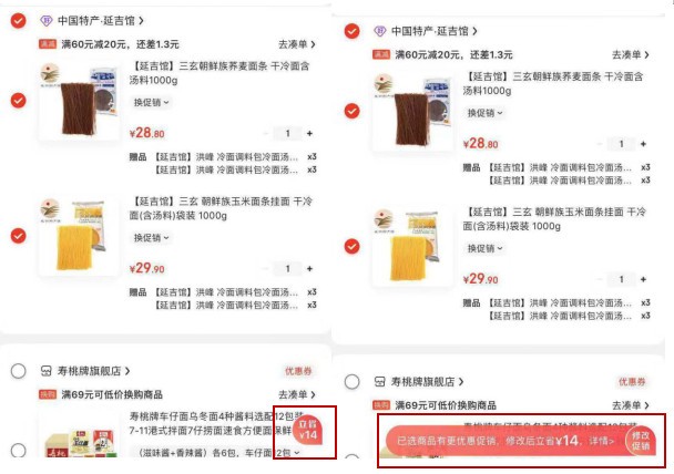
After selecting a product, if it has multiple promotions at the same time, and a certain variety of products click the same promotion but are not selected as the same promotion, a suspension button will appear to prompt "save 14". When you click on the button, a corresponding explanation will pop up explaining "the selected product has a more favourable promotion, save 14 after modification". after clicking on "modify promotion", it can be modified to meet the amount by one click.
3. The function of "frequently purchased list" improves the re-purchase rate
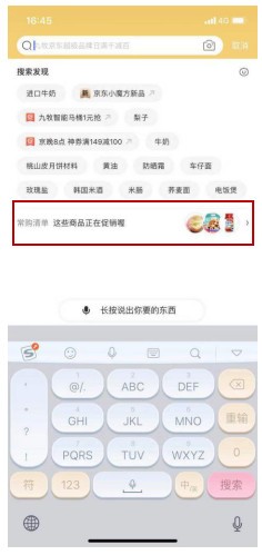
JD's search box page contains the function entry of "frequently purchased list". The list will show the existing promotions and pictures of 3 corresponding promotional products. It contains the products frequently purchased by users, the number of times they have purchased and the additional purchasing function recorded by the platform. This function enables users to continue to re-purchase the goods they often purchase without searching for the goods again or finding out the purchase order of the target goods. Most users will click to view the promotion, and there is a great possibility that they will hoard goods because of the discount.
Taobao.com
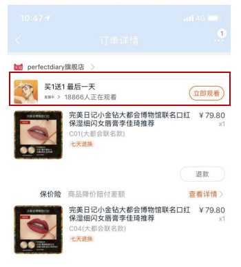
1. Add a live shopping video related to the products above the order details page
You can click the "watch now" button to directly enter the live page, and the entrance settings here are strongly related to the live. It is clear that the setting is to attract users to make live shopping.
2. Faster voucher collection and check-out
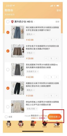
If the user is ready to enter the check-out page without receiving the voucher, the "check-out" button will be automatically changed to "receive the voucher for check-out". After clicking, the system will automatically help the user to receive the applicable voucher and enter the order submission page. This interaction can not only bring good experience to users from the operation, but also surprise users from the emotional level and promote purchase decisions.
3. Image attracts more attention than text
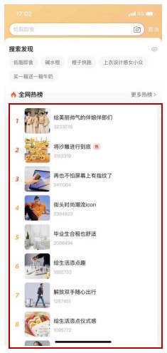
Taobao's hot search section has changed from a simple "# text topic" to a picture plus text. It contains relevant contents and hot products, and the hot list will be updated in real-time. Therefore, the click rate of the hot-list page increases, and it is also possible to drive the brand exposure rate, click rate and conversion rate of the products associated with the hot-list.
Taobao/JD: Public welfare infiltrated in minor corners promotes the image of the platforms
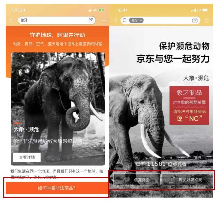
If you use the search boxes of Taobao and JD for the relevant words of illegal products of endangered animals, the following page for the protection of endangered animals will appear, which contains the knowledge of science, relevant laws and regulations related to endangered animals.
YUNJI
1. Give users the psychological expectation of sliding distance
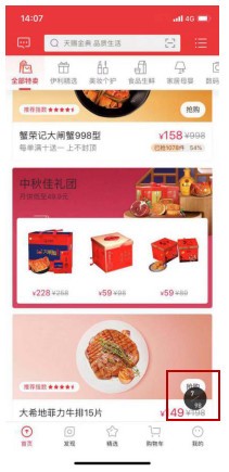
When the user touches the screen and slides down when sliding to the special selling area at the front page, the bottom right will indicate the current number of products and the total number of the entire list of special selling products (i.e. "7/98" in the figure below). When the user's finger leaves the screen, it will be changed into a set-top hover button. The design of the interaction details can give users a psychological expectation of the maximum distance of the pull-down slide and a hint of which product to browse at present. In addition, it also corresponds to the promotion core of the platform's special selling area: it virtually tells users that 98 products are new and real, thus increasing the credibility of the platform and conveying an invisible "sense of safety" to users.
2. Always keep the top entrance
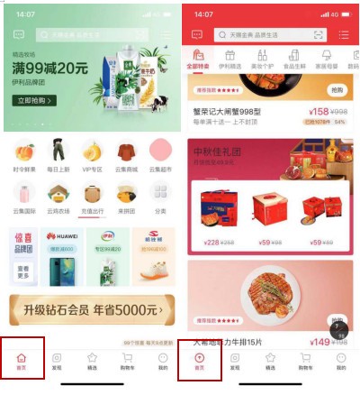
The icon of [home page] in the navigation bar will change as the page slides downward. when the downward stroke exceeds a certain distance, the icon of the home page will automatically change from a "house shape" to "↑". Other main platforms, such as Taobao, have similar settings, but the interaction design is different. Taobao can return to the top by clicking on the top area (close to the title of the page, with a narrow hot zone).
3. Recommend similar products with out-of-stock products and grasp the purchase demand
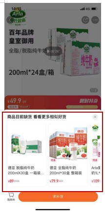
When you click on the goods that are "sold out" in the hot-selling area, there will be a stock-out floating window before jumping to the details page. In addition to setting up replenishment reminders, the floating window will also add a similar goods recommendation area, displaying 10 similar goods in a sliding way. We can tell that YUNJI doesn't want to miss any opportunity to promote the conversion. As long as it has insights of user demands, it won't miss this gap. From e-commerce platform perspective, this design is very consistent with the core mission of "assist user purchase decision".
by o @修炼中的小vc


